The Challenge
Create an intuitive UI design for an enterprise SAAS application that provides a customizable platform to organize and execute multi-channel marketing campaigns.

Create an intuitive UI design for an enterprise SAAS application that provides a customizable platform to organize and execute multi-channel marketing campaigns.

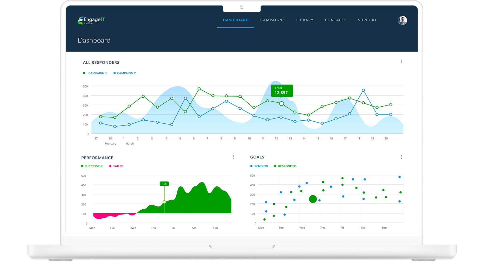
As part of this web application design, we wanted to ensure that the dashboard produced an overview of the current campaigns using visual aids such as graphs and charts to provide users with the needed information, including current campaign statuses and marketing performance, at-a-glance. The Analytical Dashboard prepares the desired data required to analyze trends intuitively and gain a clear understanding of the target market demographic.

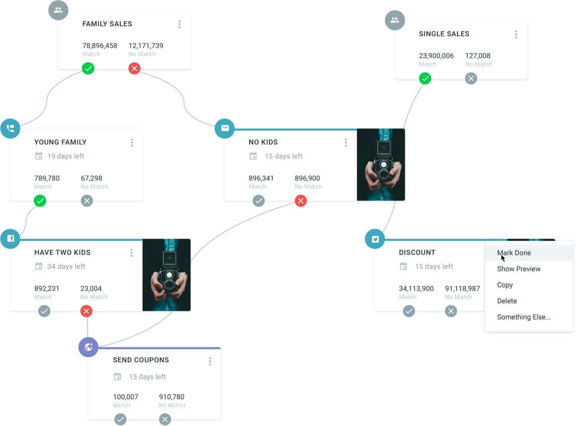
For the UI of this web application, we designed a visual card-based interface to map out and organize campaigns for users while equipping them with the ability to collaborate and visualize the connections they create between actions and filters. The interface serves as a tool to visually see the structured campaign data, better analyze the logic behind a campaign, and generate new ideas. Furthermore, this interface dramatically minimizes the learning curve for new users, as the campaign is presented in a highly intuitive way that is easy to understand and work with.

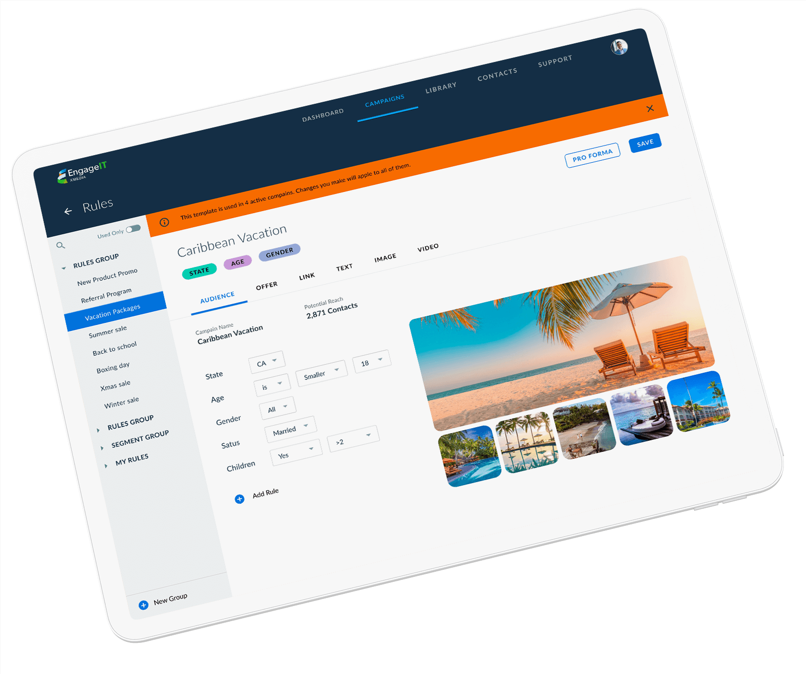
Users may spend up to eight hours a day using this enterprise application; thus it must be so we designed a user interface service that is suited for professional use. The hierarchy of visual elements guides users towards the successful completion of a task. A great deal of software usability and user intuitiveness is added by highlighting the variable data and suggesting follow-up actions while simultaneously minimizing human errors and costly mistakes.