The Challenge
Create a UX design for a workstation that meets the critical ergonomic performance criteria set forth by the National Ergonomic Standard to improve user health.

Create a UX design for a workstation that meets the critical ergonomic performance criteria set forth by the National Ergonomic Standard to improve user health.

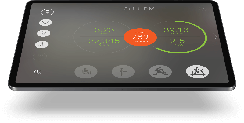
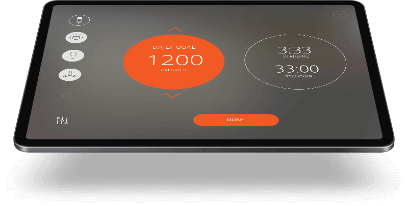
To improve user engagement, we focused on finding an extrinsic motivator that would trigger users’ desire for achievement and completion. We achieved this by leveraging a popular method of increasing user engagement, which involved incentivizing users to keep their “score” high. Attractive and powerful progress charts, along with reward systems, added a playful element to healthy business behaviour, establishing a foundation for future integration into social networks.

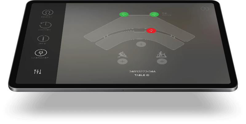
We understand that simple interactions and effective visual communication are essential for success in any UI, especially for device-controlled UI. Therefore, our team designed a clean, straightforward interface that provides users with the complete system status at a glance. The design allows users to change their actions accordingly, making the system intuitive and easy to use.

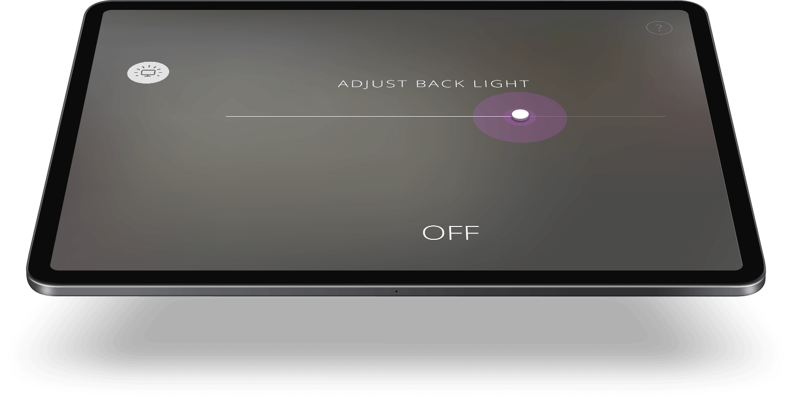
We aimed to seamlessly blend the UI into the table surface, making all controls highly visible yet not demanding valuable user attention. Our team optimized the skin for various vision anomalies and tested it to work for people affected by colour blindness. The system communications are clear and easy to read, even with peripheral vision, creating a more efficient and ergonomic system.

Our team designed a UI that seamlessly blends into the table surface, emphasizing function over form. All controls are highly visible, yet they do not demand valuable user attention, allowing for efficient use of the system. The skin is optimized for various vision anomalies and tested to work for people affected by colour blindness, ensuring that all users have access to the same level of functionality.