Google Fonts Pairing in 2024
Choosing the right font pairing can significantly impact the overall look and feel of your website or a web application. Google Fonts offers a vast library of free and open-source fonts, making it a popular choice for designers and developers. In this blog post, we'll explore some fresh Google Font pairings for 2024 that cater to various website themes and purposes.
When choosing a Google Font pairing, consider the following factors:
- Readability: Prioritize legibility by selecting fonts that are easy to read on screen. Consider factors like x-height, letter spacing, and stroke contrast.
- Contrast: Create visual interest and hierarchy by pairing fonts with contrasting styles (e.g., serif and sans-serif, or bold and light weights).
- Tone and Mood: Choose fonts that reflect the desired tone and mood of your website. For instance, playful fonts for a creative brand or elegant serifs for a luxury brand.
- Purpose: Consider the website's purpose and target audience. For example, educational websites may benefit from highly legible fonts, while marketing sites might use attention-grabbing display fonts.
- Compatibility: Ensure the chosen fonts are compatible with different browsers and devices to maintain a consistent user experience.
- Trends: While not essential, being aware of current font trends can help you create a modern and stylish website.
By carefully considering these factors, you can select Google Font pairings that enhance your website's design and effectively communicate your message.
Manrope & Inter
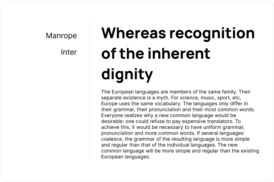
Manrope (for headings): Manrope is a modern, geometric sans-serif font with a clean and straightforward design.
Inter (for body text): Inter is a highly legible and versatile sans-serif font optimized for on-screen use.
Why This Pairing Works: The geometric precision of Manrope pairs well with the readability of Inter, creating a balanced and modern look.
When to Use: Ideal for tech startups, modern corporate websites, and applications that require a clean and professional appearance.
DM Sans & Nunito
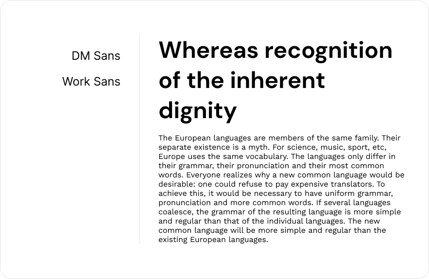
DM Sans (for headings): DM Sans is a low-contrast, geometric sans-serif typeface that is highly legible and elegant.
Nunito (for body text): Nunito is a rounded sans-serif typeface that is friendly and approachable.
Why This Pairing Works: The combination of DM Sans’s elegance and Nunito’s friendly curves creates a welcoming and professional aesthetic.
When to Use: Perfect for educational platforms, health and wellness websites, and community-focused organizations.
Epilogue & Mulish
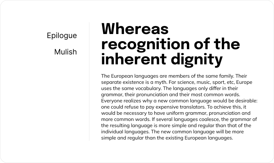
Epilogue (for headings): Epilogue is a versatile sans-serif font with a modern and clean design.
Mulish (for body text): Mulish is a minimalist sans-serif typeface with excellent legibility and a refined look.
Why This Pairing Works: Epilogue provides a modern touch for headings, while Mulish ensures readability and minimalism in body text.
When to Use: Suitable for minimalist websites, fashion blogs, and tech companies.
Sora & Heebo
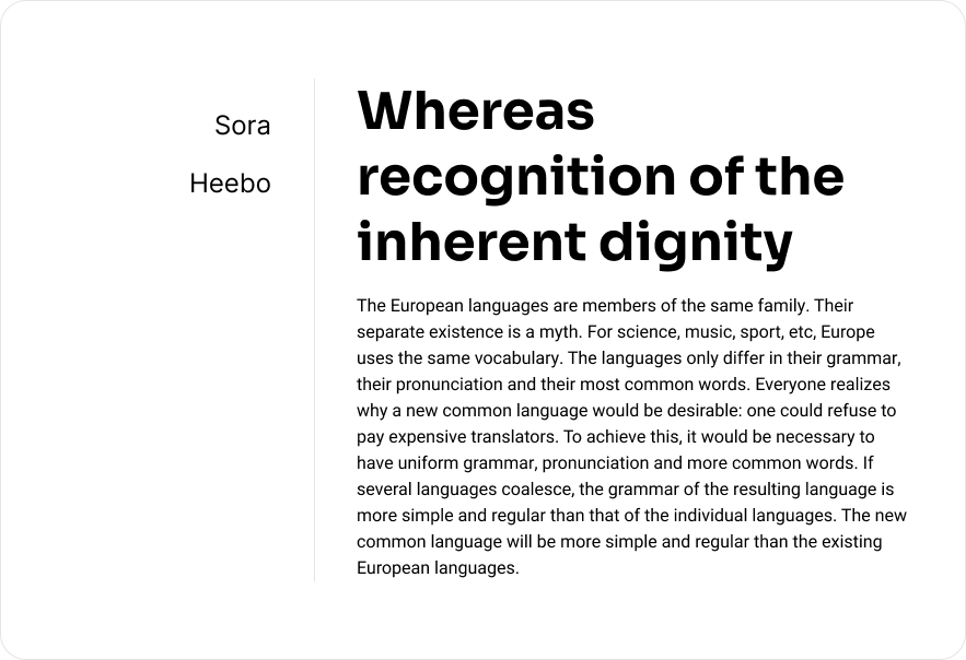
Sora (for headings): Sora is a contemporary sans-serif typeface with a strong and dynamic presence.
Heebo (for body text): Heebo is a Hebrew and Latin typeface family that offers great readability and versatility.
Why This Pairing Works: Sora’s boldness contrasts well with Heebo’s versatility, creating a dynamic and readable combination.
When to Use: Ideal for fintech startups, innovative business platforms, and dynamic content websites.
Lexend & Public Sans
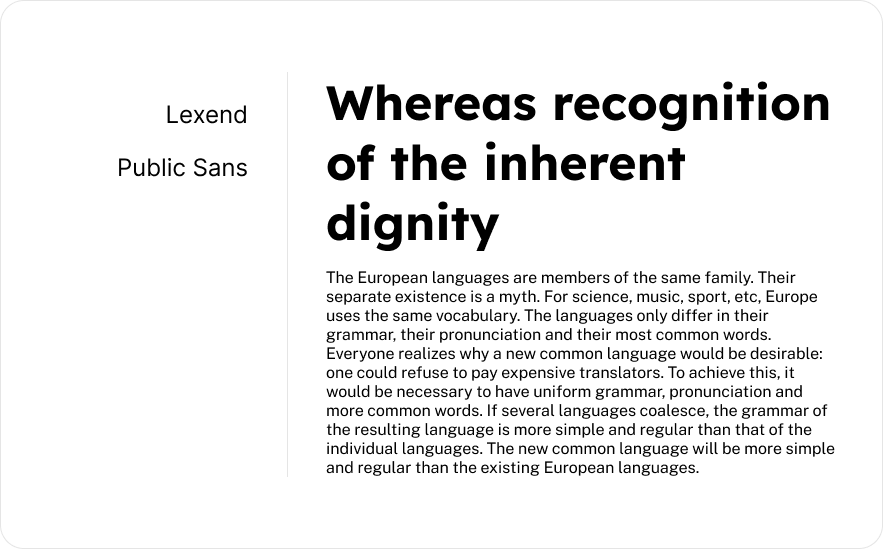
Lexend (for headings): Lexend is designed to improve reading performance, making it highly legible.
Public Sans (for body text): Public Sans is a strong, neutral typeface that works well in various contexts.
Why This Pairing Works: Lexend’s readability enhancement pairs well with Public Sans’s neutrality, making content easy to consume.
When to Use: Excellent for educational websites, accessibility-focused platforms, and content-heavy websites.
Jost & Atkinson Hyperlegible
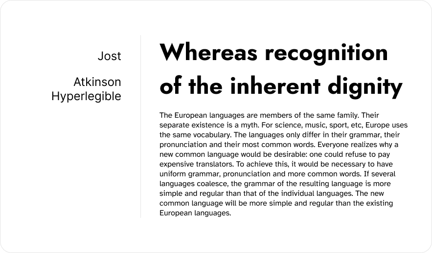
Jost (for headings): Jost is a geometric sans-serif inspired by early 20th-century designs, offering a clean and classic look.
Atkinson Hyperlegible (for body text): Atkinson Hyperlegible is designed for maximum legibility, with distinct letterforms.
Why This Pairing Works: Jost’s clean and classic aesthetic complements Atkinson Hyperlegible’s focus on clarity and legibility.
When to Use: Suitable for editorial websites, news portals, and accessibility-conscious projects.
Piazzolla & Red Hat Text
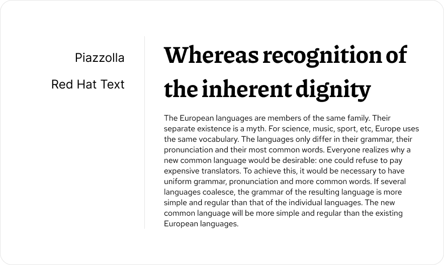
Piazzolla (for headings): Piazzolla is a modern serif font with a distinctive personality and elegant design.
Red Hat Text (for body text): Red Hat Text is a sans-serif typeface that is simple, readable, and versatile.
Why This Pairing Works: Piazzolla’s elegance and personality make headings stand out, while Red Hat Text provides a clean and readable body text.
When to Use: Great for blogs, editorial content, and websites that require a mix of elegance and readability.
These fresh pairings for 2024 offer diverse options to cater to various website themes and purposes, ensuring both aesthetics and functionality are achieved. Selecting the right Google Font pairings can significantly enhance your website's visual appeal and user experience. By considering factors like readability, contrast, tone, purpose, and compatibility, you can create a harmonious and effective design. The fresh pairings for 2024 explored in this post offer a wide range of options to suit various website themes and purposes. Whether you're aiming for a modern, minimalist, or classic look, there's a perfect Google Font pairing out there waiting to be discovered. So go ahead, experiment, and find the combinations that best reflect your brand and captivate your audience. Remember, the right font pairing can make all the difference in creating a website that not only looks great but also communicates effectively. Happy designing!