Accessibility Standards in Canada

One in five Canadians (22%) over the age of 15 live with a disability. As people with disabilities often face an increased level of discrimination than the able-bodied population, legislations have been put in place to ensure that the fundamental rights of those with disabilities are both enforced and protected on a federal level. However, in the digital era, issues of accessibility have sprouted online, and disability-specific laws aimed at website developers, owners, and designers, are used to address and solve the barriers people with disabilities may face when trying to navigate websites.
Why Accessibility is Important
With over 6 million Canadians (aged 15 and older) identifying as having a disability, a substantial portion of our national population needs accessible technology to live the same quality of life as their able-bodied counterparts. The Accessibility for Ontarians with Disabilities Act (AODA) was first passed in 2005, making it compulsory for both private and public sectors to follow a previously established set of accessibility standards when engaging with the public population. These standards are divided into five primary categories:
- Information and communication
- Customer service
- Transportation
- Employment
- Design of public spaces
Accessible websites and web content fall under the information and communication category and requires that Canadian web content follows the technical requirements WCAG 2.0 (Web Content Accessibility Guidelines) in order to ensure that people with disabilities do not face barriers to accessing digital information and content.
What Does This Have to Do With UX?
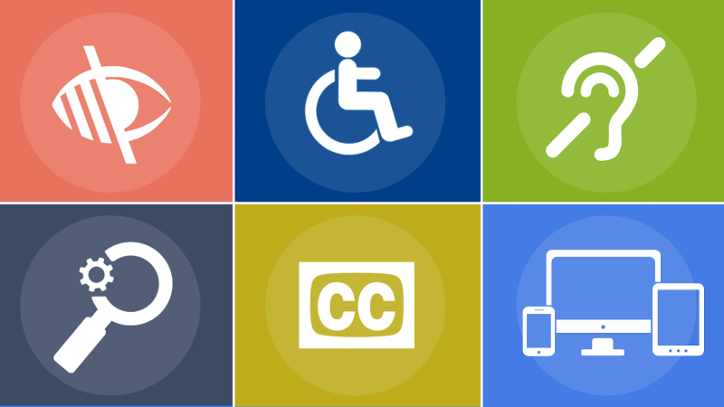
WCAG 2.0 and AODA directly impact the UX industry as designers have a legal obligation to ensure the accessibility of their websites, applications, and software. These technologies must accommodate a wide range of disabilities including blindness (and low vision), deafness and hearing impairments, cognitive impairment, limited movements, speech disabilities, and photosensitivity among others.
Good Designs are Accessible

The goal of design, especially user experience design, is to simplify the process that users have to go through to complete a task. User demographics have always been diverse, with populations ranging in ability, age, genders, cultural backgrounds, and education levels. Being a good designer has never been about being able to address and create for one type of user, rather, a good designer is someone who can effectively design for a complex, changing, and diverse user demographic.
Furthermore, it is in your own best interest as a UX designer to ensure that your website is accessible from a business perspective. Persons with disabilities make up a huge demographic, one that is globally worth $1.2 trillion dollars. Studies have shown that accessible websites lead to better search results, reach a wider audience, have faster download times, and improve SEO scores. Thus, the more accessible your application or website is, the more successful it will be.
Tips for Accessible Design

- Contrast your Colors
The WHO (World Health Organization) estimates that there are around 217 million people who have severe vision impairment. The high colour contrast between elements helps those with low levels of visibility to more easily read the content on your website or application. There are many free colour contrast analyzers available online, such as the Stark Plugin, which measures the contrast of colours and suggests alternative colours if those currently used do not provide sufficient contrast.
- Include Alternative Text
Assistive technology, such as screen readers that offer dictation services, is often used by users with disabilities. However, since information is typically communicated to users through a mixed model of both visuals and texts, screen readers can only dictate text, and thus are not able to properly communicate visual content. To address this, it is encouraged that visual elements (such as icons, buttons, and form fields) be accompanied by a text (potentially using an invisible text descriptor) that can be heard by those using screen readers.
- Include Accessibility in your Design Research.
By making accessibility a core part of your design research you will be able to save both time and money down the road. It’s often more expensive to have to make adjustments to designs after the fact than to just include them in the design process from the start.
- Control Autoplay
Autoplaying videos are often annoying for any user, but for those with disabilities, it may be much more difficult for them to skip over such content than other users. The WCAG 2.0 has stated that any audio or videos that play for more than three seconds ought to include control mechanisms, and the same goes for any content that moves, scrolls, or blinks automatically (for longer than five seconds).
- Make Accesskeys an Option
Accesskeys refer to shortcuts that are accessed by pressing a specific key. For example, on some social media platforms, the letter “L” enables users to like posts. However, while this may be convenient for some users, those with disabilities may experience decreased usability as Accesskeys are often not compatible with screen readers or may conflict with OS-defined keyboards. Instead, make Accesskeys an option that users must manually opt in to avoid accidental interactions between users and the interface.