2020 Mobile UX Trends
We looked at the top mobile UX design trends back in 2018, and while some trends such as colourful designs, animation, and emotional design, have continued to be just as prevalent as they were two years ago, new trends have also gained popularity. Below we will take a closer look at the new trends that have been characterizing mobile UX design in 2020.
Bottom Sheets
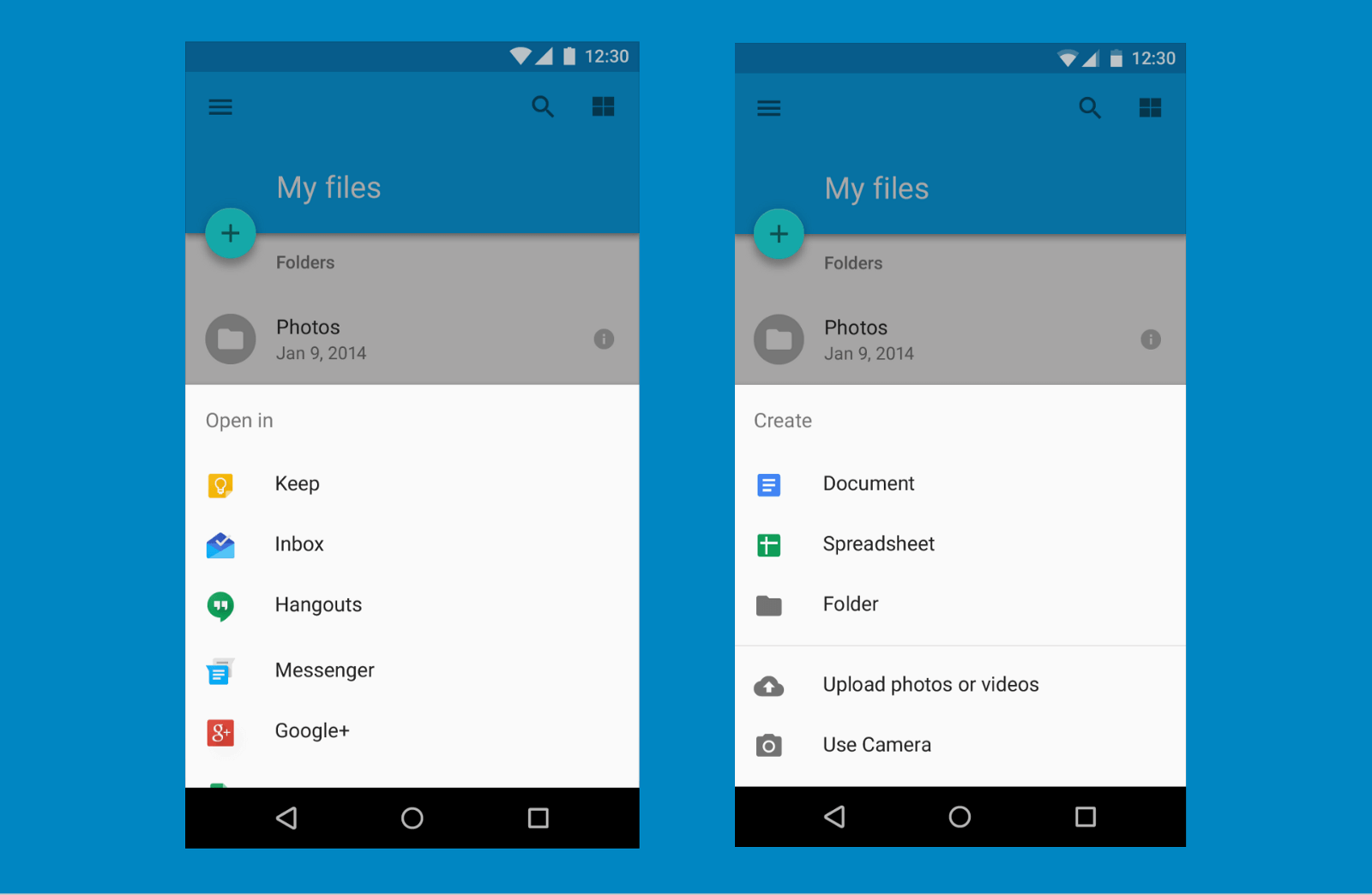
As a result of the increasing size of phone screens, bottom navigation has become a prime location for important buttons as users can more easily reach them with their thumb than when they are placed at the top of the screen. Whereas the bottom navigation bar has been around for some time, we expect that it will be overtaken by bottom sheets, which are quickly becoming the preferred method for sub-flows by designers, rather than the classic overflow drop-down or pop-up dialogues. Bottom sheets allow for multitasking as well as both a vertical and horizontal scroll, providing the user with a seamless experience that was previously not possible with other navigation methods.

A Passwordless Future
Passwords may soon become a thing of the past as companies move forward with new options for identity authentication. With the rise of biometric recognition, fingerprint scanning, and facial identification, many companies such as Apple, Slack, and Whatsapp are opting for quicker login features for users to improve their overall user experience. As software and hardware of applications continue to develop, we expect to see a complete shift from usernames and passwords to new authentication methods. Eliminating passwords will not only lead to improved security for users as it decreases the opportunities for potential breaching, but it also requires lower support costs from companies while providing a better user experience.
Increased Personalization
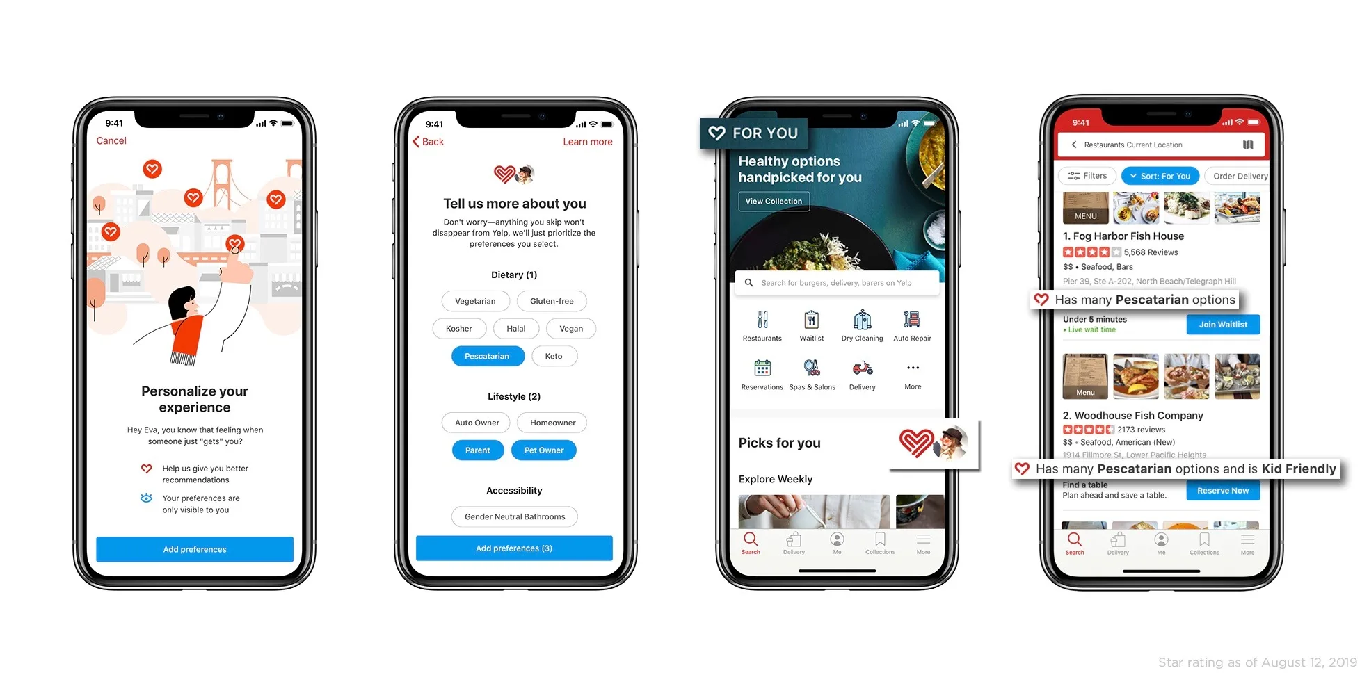
First, we must distinguish between personalization and customization. Whereas customization occurs when a user creates changes within an application in order to suit their specific needs, personalization is implemented by the system (and developers who created it) itself. Increased user personalization will gain traction in 2020 as AI and machine learning improves. Many companies have already incorporated a tailored user experience within their applications, such as streaming services like Spotify, Apple Music, and Soundcloud, which provide users with recommendations based on their listening history.

Dark Mode
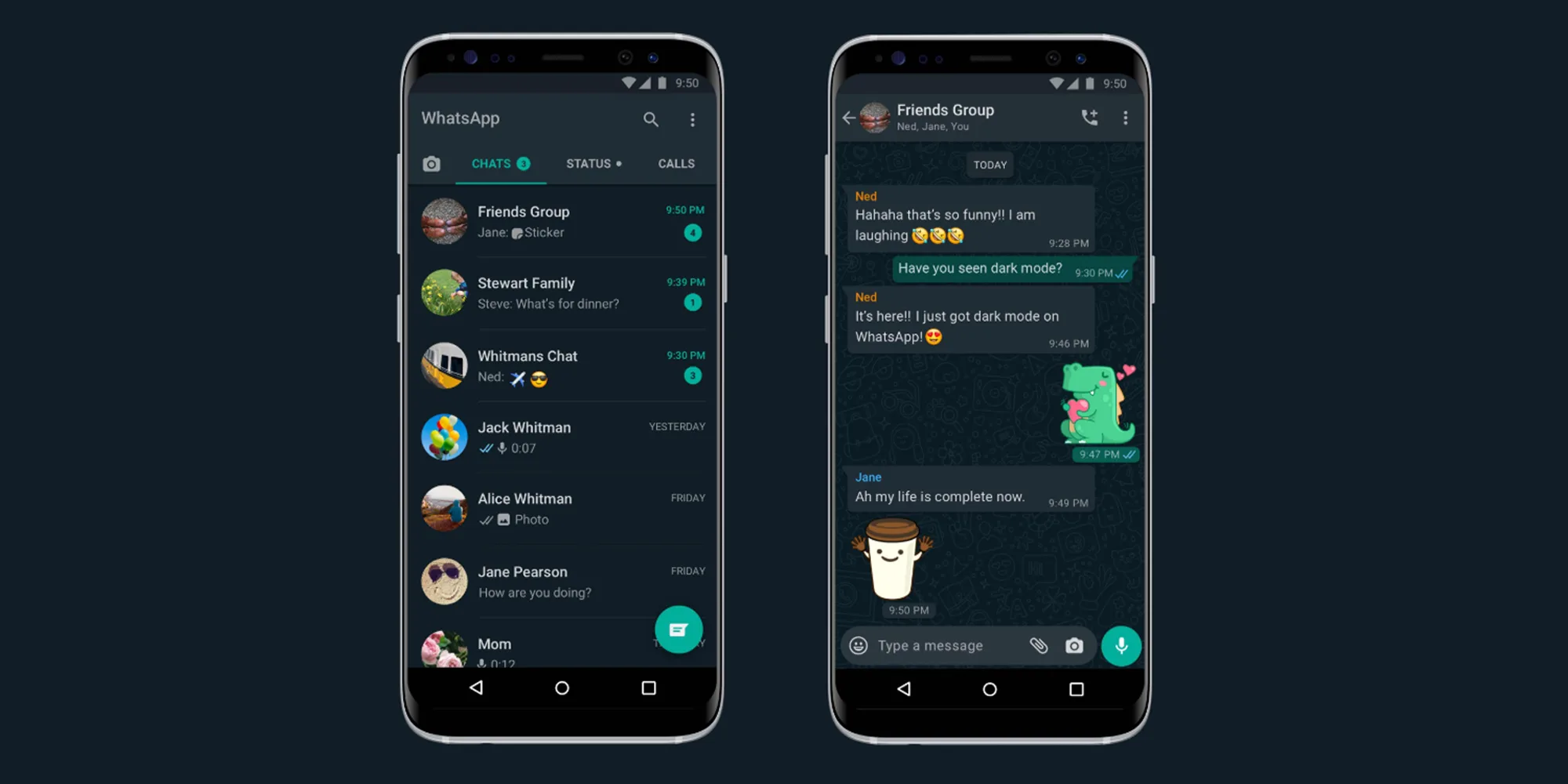
While the dark mode is not new, more and more applications are providing users with the option to pick between light and dark themes. Dark mode has many benefits for users, with the most prominent one being reduced eye strain and increased battery life for mobile users. Often, dark mode is used to reduce the contrast between users and their surrounding environment, as was demonstrated by Netflix, since movies are often watched in the dark, it makes sense that their platform mimics that of a movie theatre with dark backgrounds and light text. However, it should be noted for designers that dark mode can often be achieved with varying levels of dark blues and greys, rather than pure black, as pure black can often create too harsh of a contrast.

Buttonless Design & Rounded Corners
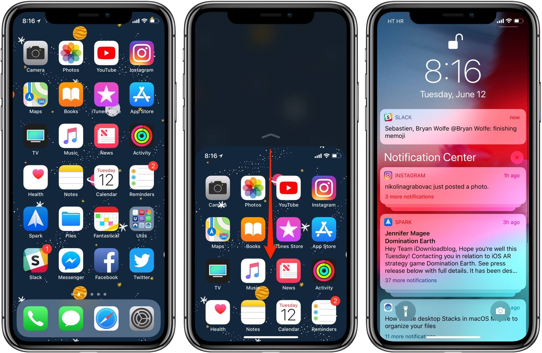
The latest iPhone, Samsung, and Pixel are all home button-less, and this shift can create a bit of a learning curve for new users. The home button has acted as a compass for users for well over a decade, but as smartphones advance they are taking up precious real estate, and thus, they are being left farther and farther in the past with the release of new smartphone models. A greater emphasis has been placed on gestures, primarily the liquid swipe effect, as a replacement for the home button. In light of this change, most smartphone devices now have curved corners, which are replicated in the interface of apps and mobile sites. This is a win for UX design, as rounded corners are not only easier on the eyes, but help users process data more easily.
