Top UX Design Trends in 2018
Minimalist Design
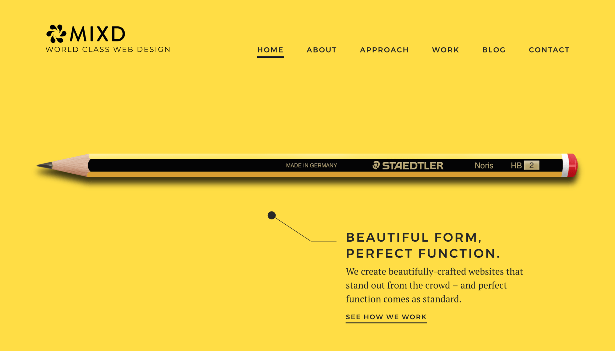
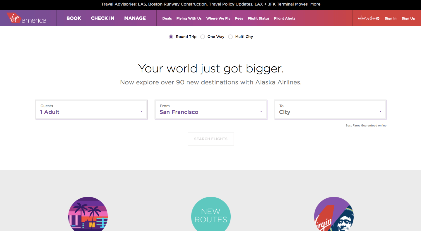
Minimalism has maintained its spot in the limelight during 2018 for good reason. Adopting a simple design approach with a distinct visual hierarchy allows users to focus primarily on the content before anything else - which is the goal of any platform. The idea behind a minimalist design is to remove any excess elements that are proven more decorative than functional. This provides the audience with a content-centered experience. Practicing minimalism in UX Design allows for more clarity and speed amongst users due to the elimination of “design clutter”. Negative space, also known as the empty space between the content and other elements has been growing in importance over these past few years. The proper use of whitespace lets users easily scan through the content and find what they are looking for quicker.
Personalized Design
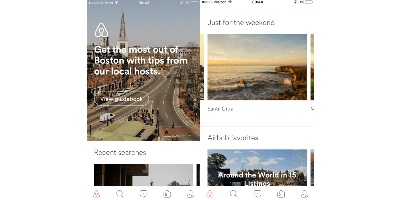
Users greatly benefit from a personalized UX Design, which can be achieved in a number of different ways, with the ultimate goal being a faster and easier experience depending on the needs of each user. Personalized design can come in many forms, such as but not limited to, login memory features, notifications, and chatbots. Each of these features offers a chance for personalization, which makes users feel like the device or app they are engaging with offers a more human-like and intimate experience. Airbnb is a great example of this practice, as their guidebooks are tailored to each user's current location.
Flat Design
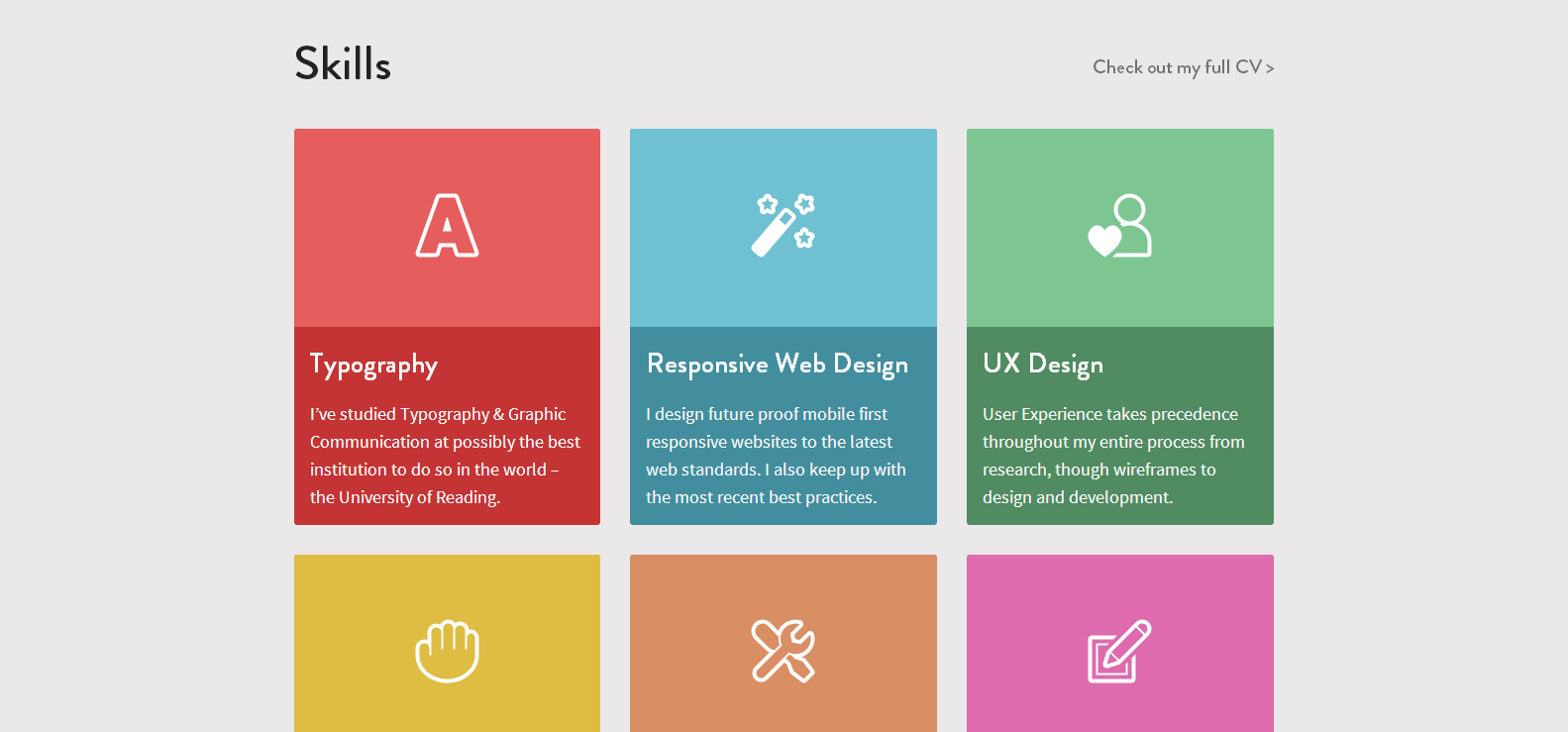
Skeuomorphism - the design that tends to imitate both the look and behavior of real-world objects gave way to flat design several years ago. Flat Design emphasizes usability through clean and two-dimensional illustrations that are far from realistic. Flat Design holds much of the same values as minimalist design: simple, spacious, and eye-catching. UX plays a heavy role in flat design, as with all the decorative features being gone, it must rely solely on efficiency and functionality to create an exceptional user experience.
Efficient Design
The amount of time saved is steadily becoming one of the most significant determinants of a well-designed application. The sooner users locate the information they were looking for, the more satisfied they will be with their experience. Easy navigation, clear instructions, and straightforward assistance are all examples of a time-saving design, one that depends on simplicity and functionality to deliver its users the best experience they could possibly get in the shortest amount of time. Time-saving design often follows a linear structure, which gives users relevant options on the homepage and uses the information provided by users to guide them to the next step.
Augmented Reality
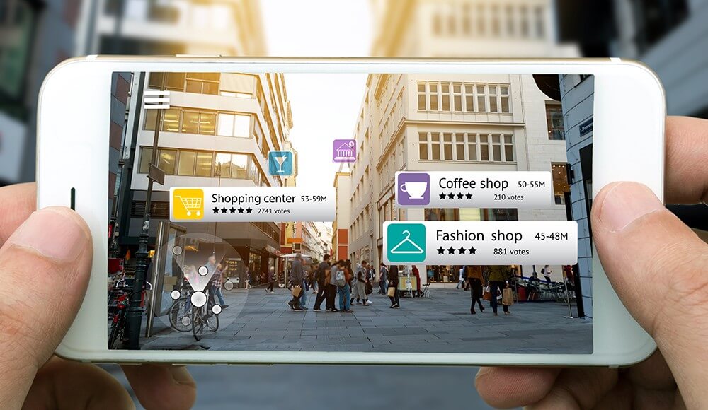
Due to technological advancement, augmented reality is a trend that is becoming more and more present in UX Design. AR relies heavily on a smooth integration of both virtual and real environments to enhance the user experience. We have seen a surge of AR being used in recent years by huge companies such as Google, IKEA, and Snapchat. Although the successful implementation of AR can be challenging, it also opens the door to a variety of new opportunities to meet user needs that can put a company far above its competitors. As AR gains popularity in upcoming years, we will likely see more and more companies begin to incorporate it into their services, which if done properly, can yield fantastic UX results.
