UX & UI Design Trends 2015
The field of UX design, like any other design field, usually sees some drastic changes from year to year as the cultural zeitgeist changes with the times. What worked last year or the year before isn’t necessarily going to hold much water this year. 2015 is no different. There are a few trends that have been prevalent in the UX design services market this year, all of which have made for some outstanding UX projects.
Here is a list of some of the top UX design trends in 2015:
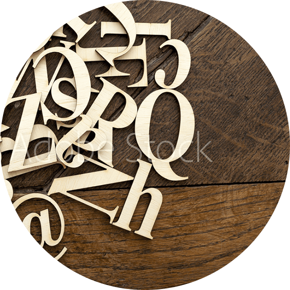
Free web fonts and more reasonably priced packages of premium fonts have led to an increase in the use of fonts as an element of good design. Fonts are something that, in the past, were often overlooked. This was primarily due to the fact that it is a somewhat passive element and is not always as “in your face” as some other design elements. Now, with responsible fonts and the need for increased readability, fonts have become an important element.
Another change that has been coming for years is a move away from reliance on stock photography. The reason for that change is simple: People can now see through it. They want to see custom photographs of businesses that convey what the business is actually about, rather than stock photos from one of the dozens of sites offering them.
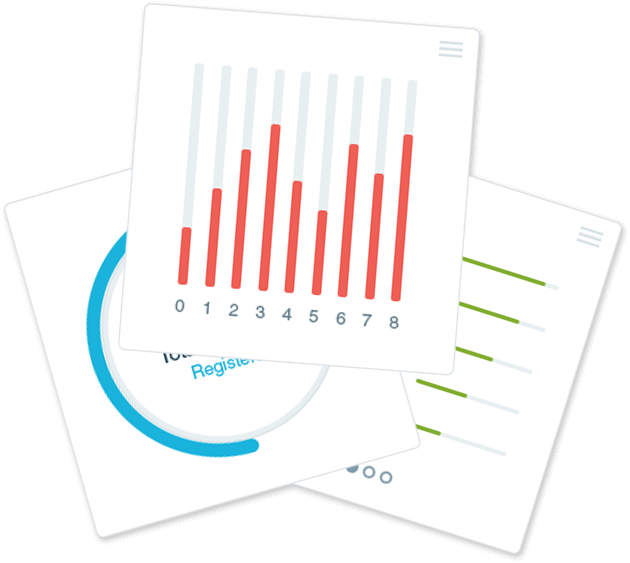
Driven primarily by social media, tiles, and cards have become one of the preferred methods of UX design over the last year. You are likely already familiar with what these look like, especially if you have used sharing sites like Pinterest or Twitter. These cards are modular, which gives the functionality that drag and drop interfaces often have.
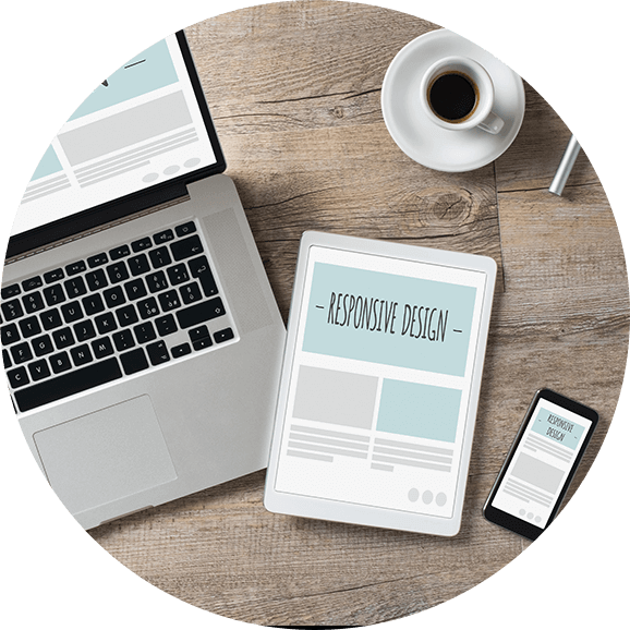
Let’s face it: Mobile apps and mobile devices are here to stay. With that being said, desktops and laptops aren’t going away anytime soon. Thus, there is a need for sites to be responsible to the type of device that they are being utilized on. This is something that has become absolutely essential for websites.
The idea of layering, displaying things on top of one another, is nothing new. The flat design concept, however, is something new. It has been implemented by Apple, Google, and Microsoft over the last year. This design style is focused on content, flexibility, and the interaction between different elements. The implementation of material design helps to make sites look more clean and to eliminate unneeded elements (helping the page to load faster).
If you have used the Internet at all this year, you have likely seen these changes occur right before your eyes. You may not have thought about it at the time, or known quite what you were experiencing, but they were there. The one which may have had the most obvious effect is responsive design. That would be followed by the design cards, found on many popular sites (and even newer Windows OS such as Windows 8 or Windows 10.