Vista and Windows 7 GUI mystery
When I first saw Vista my initial reaction was “what the heck?!”. It wasn't incompatibility, performance, nor stability that caught my attention. What amazed me at that time was the Vista GUI, which now seems that it will transfer over to Windows 7. So what is so special about it? To tell you the truth I can’t see much logic behind it.

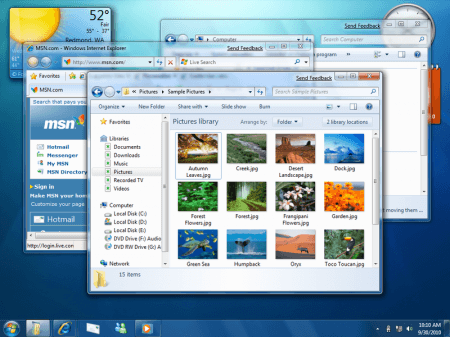
Windows 7 Desktop Screenshot
Windows 7 semi-transparent windows frames
Wallpaper is the most obvious way to personalize the human-computer interaction experience. All OS vendors provide an easy way to customize it. We use personal photos, stock photography or even rotate set of images. Desktop (wallpaper for Windows users) is traditionally given to a user to make the computer interaction experience more “personal”. As a result the OS GUI designers have no way to predicting the wallpaper color or image palette.
Fancy background colors can be very distracting. A logical move for a designer would be to isolate a user from potentially distracting desktop environment so that they can focus on task on hand. MS decides not to do that and introduces transparent windows instead. On top of that they blur content underneath the window (making it very clear how hard it is to use a computer if you can’t find your glasses). Note that about a year ago Apple tried to introduce a transparent tiny bar on top of the screen and had to back down from making this feature optional due to user complains.
Transparent windows immediately create another problem: blind window titles. Making them dark doesn't make them readable on a dark background and white wouldn't work on bright wallpaper. Many designers would say, “Hey! Something is wrong here. Let’s backup.”
Instead Microsoft habitually chooses to apply a “patch” which introduces a white glow around letters which doesn't fix anything
Incidentally, the need for patches is a sign of weak design structure and of logic flaws in the original design. Not only the GUI design but any design in general (not to be confused with ”art”). Good design tends to achieve the maximum with the minimum. Any design is a structure or set of rules based on a certain logic — physical or abstract. For example we can look at a chair as a set of physical rules. If your design requires you to introduce a 5th leg and then in turn 2 small legs to support that 5th then you may want to start from the beginning and rethink the original concept. GUI design is no exception. OK, back to Windows issues.

Windows7 GUI Transparent frames. Transparent on blur on transparent over blur
Not only is the user presented with information he or she doesn't require but this information is also unusable. Why is it required for a user to see the text underneath a blue colored window to the point of unreadability? If my wallpaper is colorful enough my windows will inherit the colors and will look different, which violates the very core of consistency for similar elements.
Window Titles
The absence of windows titles is an equally strange decision. Window titles oddly position inside the main frames, which makes them potentially invisible if several windows are open. Try to understand what is the third window on the above image (the one above the clock).

Windows titles
Other Issues
Another issue worth mentioning is the window footer icon. I’m not sure why they need this icon there in the first place, but it is strange to have the footer height dictated by the icon size.

Windows7 Finder Window Footer
Active/inactive rules set in windows clearly don’t apply to widgets. They are in the background but behave as active windows, with strong shadows and no faded colors.
Summarizing, it looks like Microsoft’s patching practice will also be applied to the GUI of upcoming Windows 7. It also quite apparent that many visual effects have nothing to do with optimizing user experience and just follow the “rich” GUI trend.
To be continued…. (probably)